Screen size
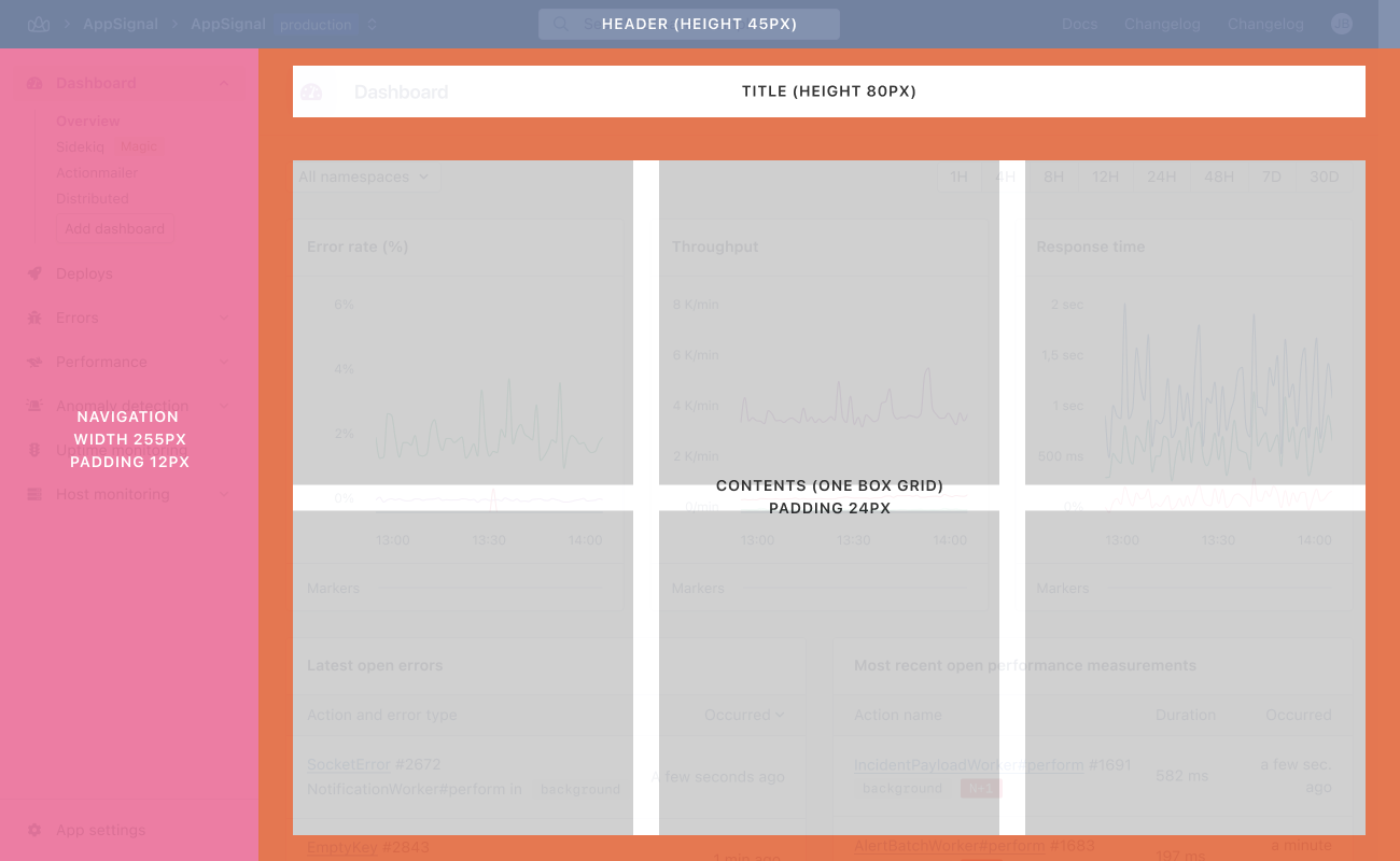
The application uses a single responsive breakpoint at 1300 px to switch between two layout modes.
|
Viewport |
Behavior |
|---|---|
|
≥ 1301 px |
Full layout. navigation and content sit side by side with room to breathe. |
|
≤ 1300 px |
Compact layout. content area shrinks to fit; navigation width is preserved. |
Anatomy
Every page shares the same vertical structure:
|
Region |
Height / Width |
Notes |
|---|---|---|
|
Header |
45 px fixed height |
Always visible. Contains logo, search, and global actions. |
|
Page bar |
80 px fixed height |
Page title and contextual actions. |
|
Navigation |
250 px fixed width, 12 px internal padding |
Persistent sidebar on the left. Width does not change between breakpoints. |
|
Content area |
Fluid (one-box grid), 24 px internal padding |
Fills the remaining horizontal space. |